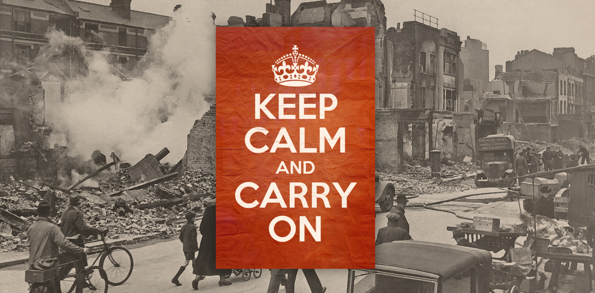
Over the years you may have seen the image of a regal looking crown with the phrase “Keep Calm and Carry On” below it but although the popular design has adorned everything from posters to coffee mugs most people aren’t aware or its true origins.
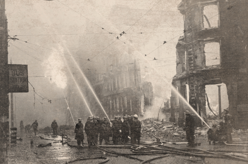
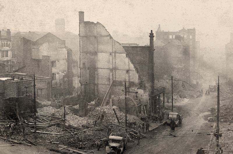
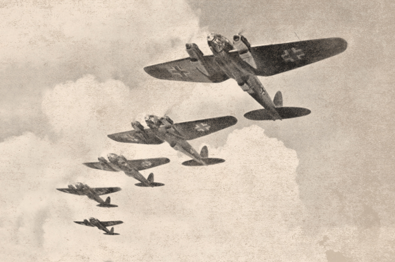
The story behind the artwork may just surprise you as will its age. So let’s hop in our time machine and travel back to the year 1939. As Great Britain prepared for the Second World War, tensions ran high throughout the country. They were facing a truly formidable enemy and it was predicted that in the coming days, massive air attacks from German bombers would take place on many major cities throughout the country. Word of this news was expected to cause widespread panic among the people of Britain.
To help minimize this potentially disastrous reaction, the Ministry of Information (MOI) created an innovative wartime “home publicity” campaign. A poster with the words, Keep Calm and Carry On, was the first in a series of three iconic posters designed with the intent of calming the people of Britain and elevating their morale as the war ensued.
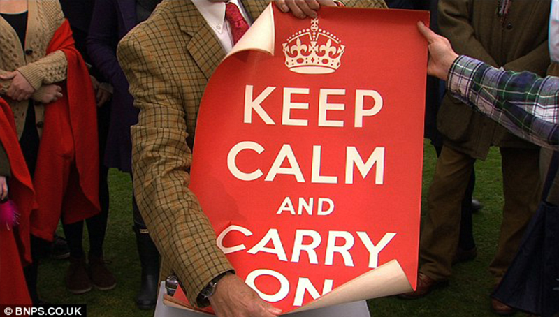
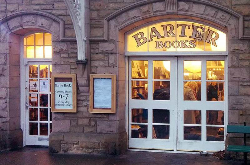
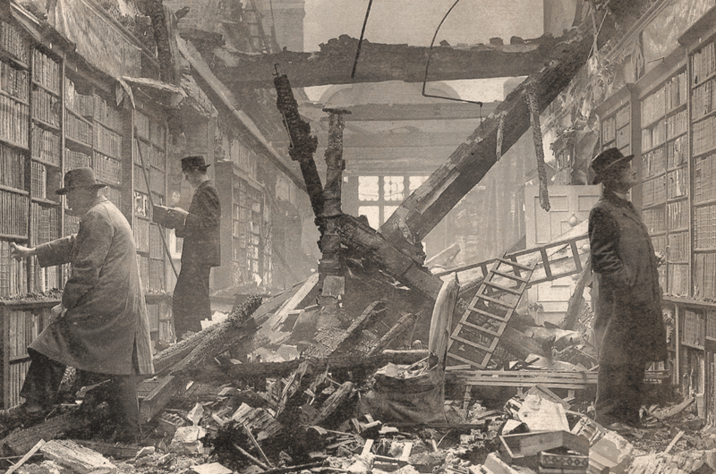
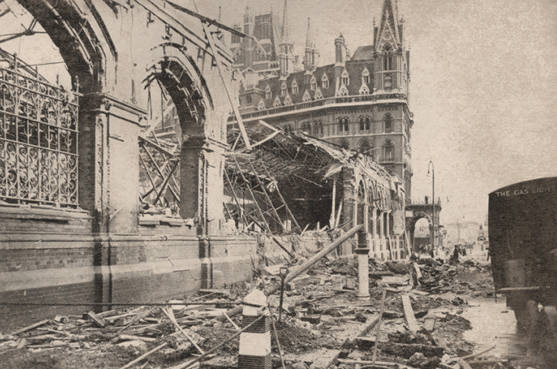
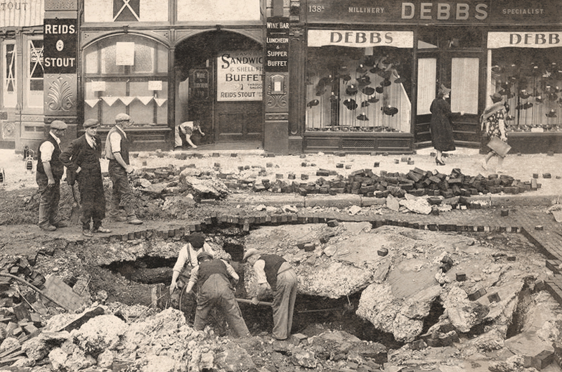
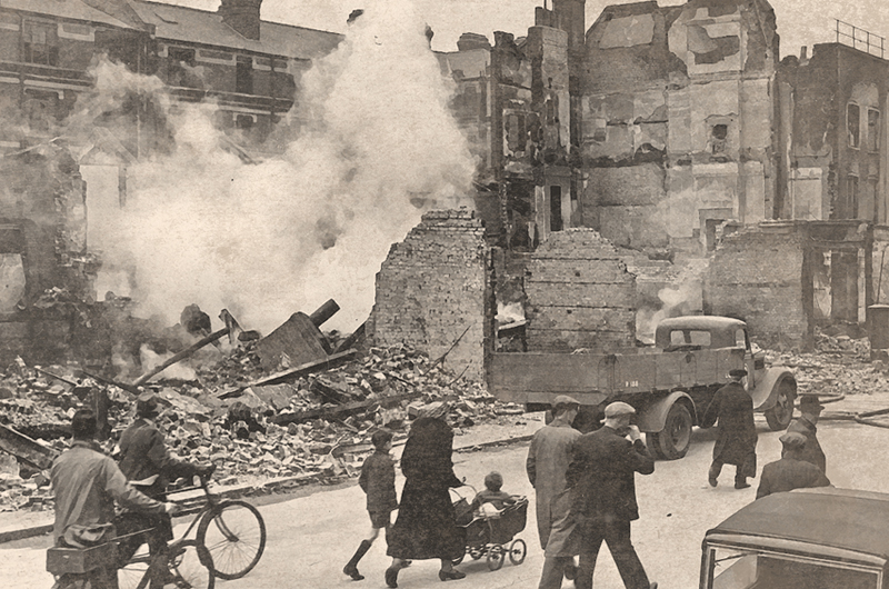
The campaign debuted between June and July of 1939 but surprisingly the design pictured above was barely used. Although records indicated that nearly two and a half million copies of the poster were printed, the amount of public display it received was nominal and it’s very existence was all but forgotten. In fact, none of the prints were thought to have survived until the year 2001. That’s when a single copy was rediscovered in a small bookshop called Barter Books located the northern English town of Alnwick. So why were the posters never distributed? …and more importantly why do very few originals of the poster exist today? The bombing that was predicted, known as the Blitz, did in fact occur and panic did ensue among the people as towns and cities were ravaged by the war.
Well as it turns out… the poster was not sanctioned by the British government for immediate public display. It was therefore decided that the majority of the posters that were printed, should remain in “cold storage” for use only after serious air raids. It is still not entirely clear why they were not used since the posters were readily available for distribution. What we do know is that the resources for the campaign were quickly diverted to the production and distribution of the other two posters with the messages Your Courage and Freedom is in Peril. The vast stores of the Keep Calm and Carry On posters were retained until April 1940, but stocks were then reduced to pulp as part of the wider Paper Salvage campaign later that year. It was thought that only two original copies survived until a collection of about 15 was brought in to the BBC’s Antiques Roadshow in 2012 by the daughter of an ex-Royal Observer Corps member.
Today the design is known the world over, although very little is known about the actual designer of this piece of British history. I don’t know if the original designer of this poster, who was believed to be a civil servant within the Ministry of Information, ever expected that it would become the icon that it has grown to be. Especially since it was mandated that the posters not resemble any commercial advertising of the time. Just how much input he or she had in the final concept is shrouded in mystery. As simple as the message may appear today, the campaign was a result of extensive planning that began in April 1939. The initial designs were prepared after lengthy meetings between officials from the Ministry of Information, the HM Treasury and the HMSO in June of 1939. Development of concepts continued until final designs were ultimately agreed by the Home Secretary Samuel Hoare in August of 1939 and put into production very shortly thereafter.
There is no doubt that the bizarre and somewhat tumultuous history of this iconic design intrigued me. Personally I am a fan of the piece and think despite it’s age it was ahead of its time. The modern looking sans serif typeface was most likely hand-lettered which would have been common at that time but is strikingly similar to Gill Sans or Johnston. I’m not sure if it was chosen for legibility at a distance or simply to stand out from other official campaign pieces but one thing is fairly certain. The color was clearly chosen to grab peoples attention and the cleanly illustrated crown helped validate the poster as an official piece from the Ministry itself. Who knows why it was never used. Maybe the color too closely resembled the reality of war or possibly the message was too soft in a time when strength was needed. In my opinion it was beautifully executed and will remain an icon for years to come.
If you are interested in learning more about this amazing campaign Barter Books created a short film about it in 2012.
Sources
12

Comment