Brand Development | Cartography
Washington Metropolitan Transit Authority
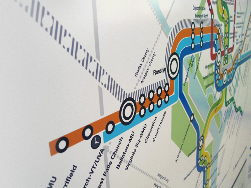
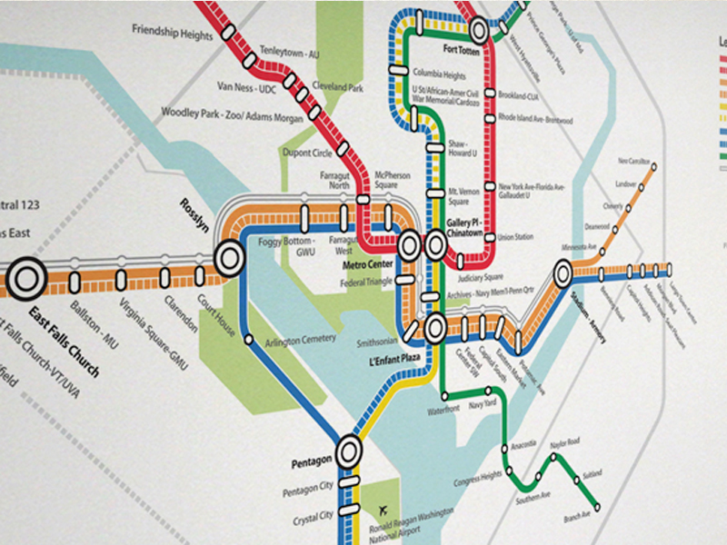


The Washington Area Metro Map originally designed by Lance Wyman in 1976 is considered by many to be a visual icon. This map has been used as a model for other emerging systems throughout the world due to it’s simplicity and ease of navigation.
In late 2010 I worked with a team of designers and strategists tasked with redesigning the map to accommodate upcoming changes to the current rail system and routes. My role as art director and the lead designer was to help define visual conventions that would drive the look and feel of the new maps.
So how do you set out to redesign a visual icon that is known the world over?... With a lot of research. Our design team studied over 250 variations of transit maps from both the past and the present going all the way back to the first metro system, “The London Underground”.
We looked carefully at all the attributes of each. The analysis included some of the most traveled mass transit systems in the world servicing cities such as New York, London, Paris and Tokyo. We paid particular attention to the visual conventions that all the different systems had adopted over time as they evolved and expanded. We took into account a variety of specific parameters found in the maps such as the importance of colors, patterns, icon systems and numeric codes. And for objective comparison we read public commentary on the topic and looked at visual interpretations done by individuals to better determine what public expectations were for the new map.


As for the designs it was necessary that we stayed true to the esthetic of the original map while keeping an open mind to all possible solutions. All the necessary levels of complexity required by the expanding system had to be added but it needed to be done in a way that was simple to read and understand. The final designs were the combined results of our entire team’s research and were focused on producing a breadth of options that could translate into solid visual solutions. I personally worked on 7 variations of the map. Each containing new and unique visual conventions that would help achieve current and long-term goals.
Because of the visibility of this visual icon, major changes to the map are more susceptible public scrutiny.
The maps we developed were run through a series of focus groups to test various visual attributes and an gather qualitative and quantitative information on their effectiveness. Although our team was not responsible for the creation of the final map design (they called Lance back in for that) I feel privileged to have been a part of the process and to know that the information gathered has ultimately helped in the creation of the next generation of the map.
Project Details
Client: Washington Metropolitan Transit Authority
My Role: Art Director, Lead Designer
Work: Brand Development | Cartography
Designed for: Belmont Inc.
My Role: Art Director, Lead Designer
Work: Brand Development | Cartography
Designed for: Belmont Inc.