Branding | Website
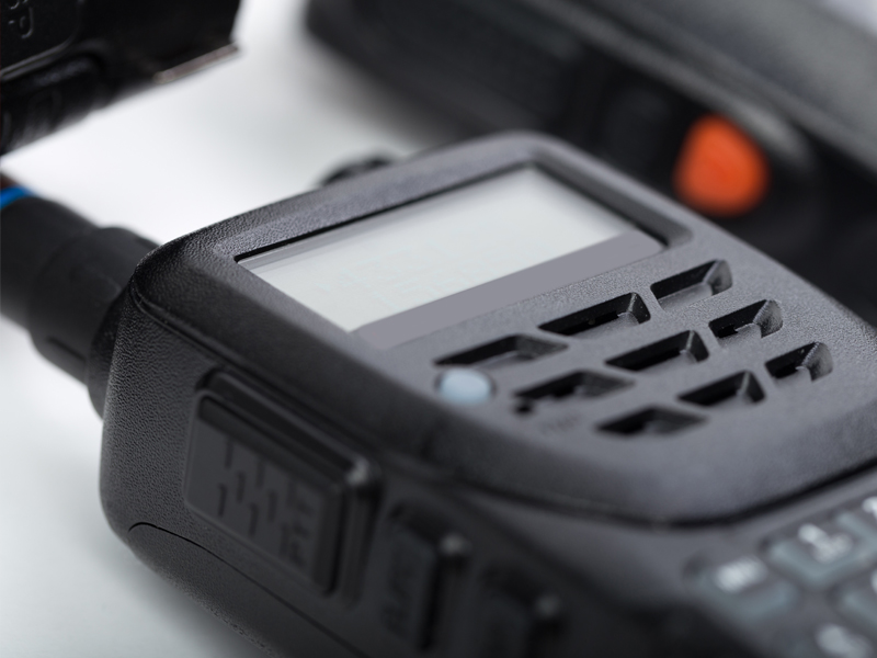
MetroTalk provides commercial two way radios, repeaters and satellite phones to a wide array of clients ensuring they stay connected when it matters the most.
MetroTalk is a company specializing in two-way radio communication. Providing a wide array of communication options to government agencies, corporate security companies, sports and music venues as well as first responders, their goal is to pick up where traditional mobile phone communication leave off. Their technology is particularly suited for crowded environments where cell signals can be sporadic or intermittent such as concert halls or large cities where buildings may block signals.
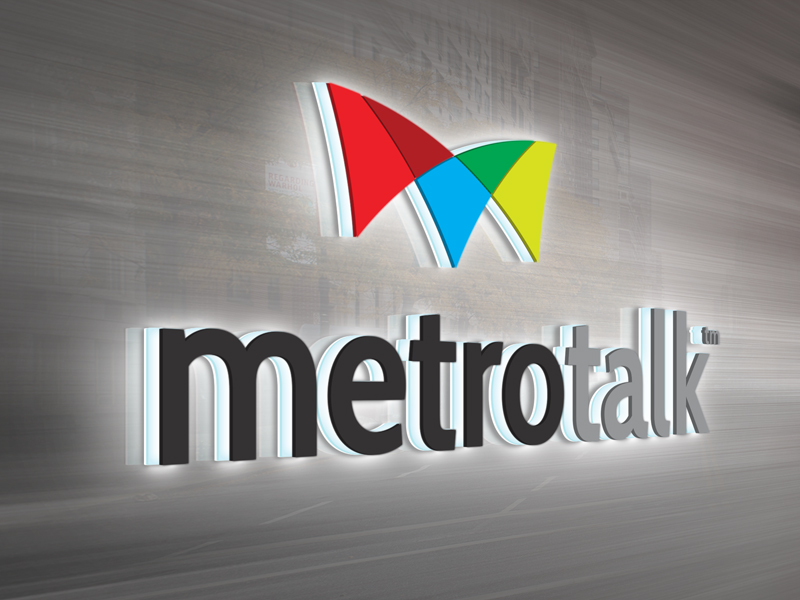
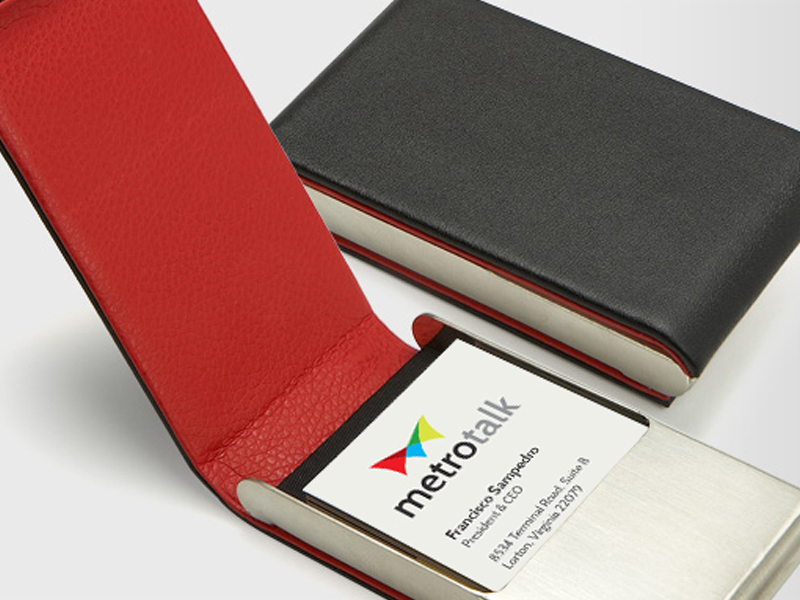
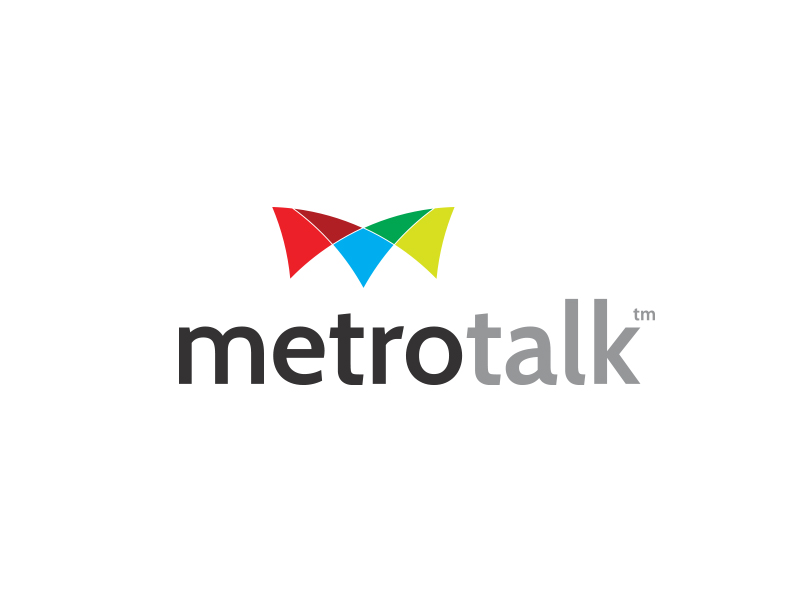
When I was tasked with developing a new identity for MetroTalk it was critical that the logo mark conveyed the idea of communication between multiple parties in different areas. The mark itself is a stylized letter "M" that resembles audio waves. In order to contrast the monochromatic products that they sell a vibrant color palette was used in the brand identity as well as in the extended brand to represent the two core options the company offered, rental or purchase.
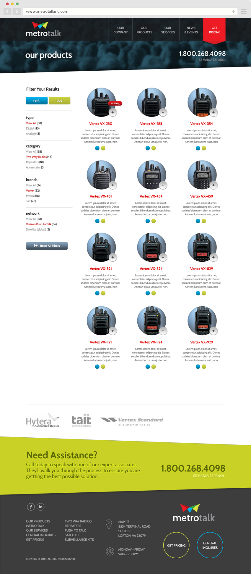
The website was developed to allow customers to find the perfect solution by filtering their products by type, category, brand or network. With over 60 products, each of which had different features, it was critical that customers find the hardware solution that fit their individual needs. They stocked nearly every major brand of two-way communication devices including Hytera, Tait and Vertex Standard.