Branding | Website


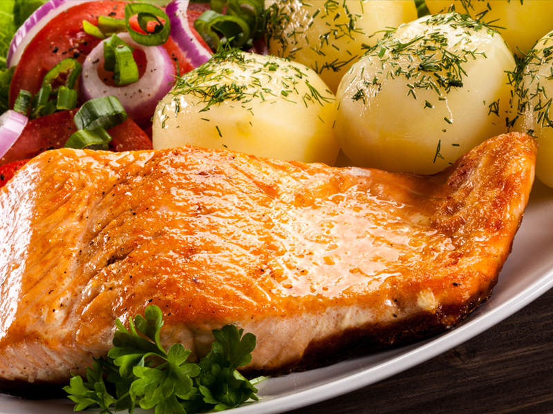
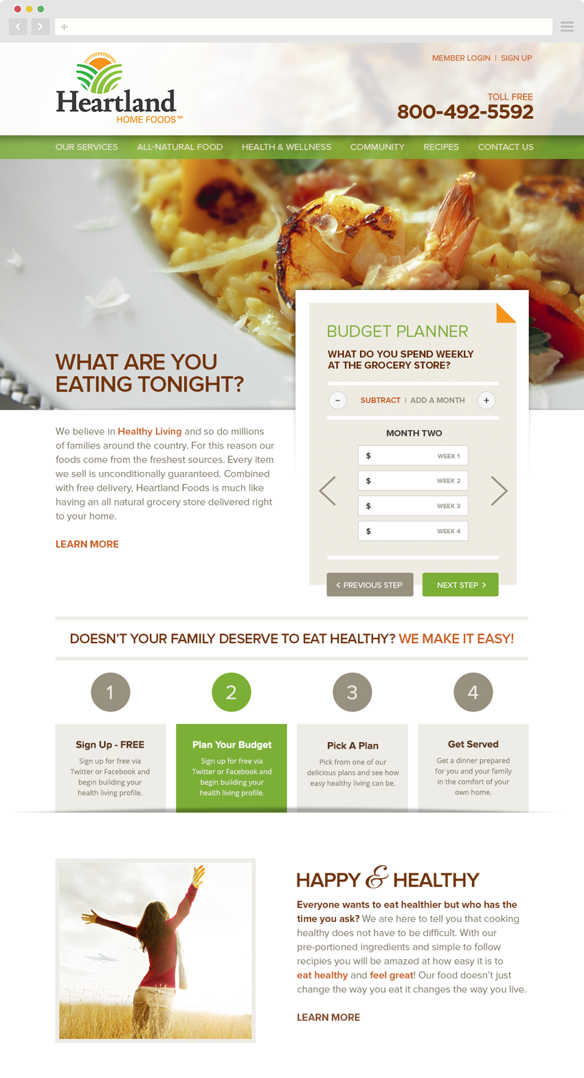
Heartland Home Foods is a meal planning and delivery service. They offer a wide array of all natural items such as wild caught seafood and fresh organic vegetables, priding themselves on providing only the highest quality foods to their customers.
Heartland Home Foods primarily markets to busy families who want to maintain healthy lives but simply don’t have the time to shop and prepare nutritious meals. Historically they have used a combination of direct mail campaigns and word of mouth to promote their products using their website as a endpoint for providing additional information about the company. Serving the clients throughout the mid-Atlantic region of the United States, this had worked fairly well for them. But looking forward to the future they wanted to streamline their operation and give their brand an updated look that would ensure longevity.
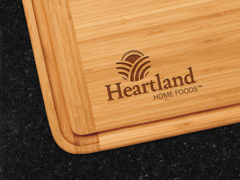
The goal when developing the initial logo concepts for Heartland was to reflect the various elements of the company and the products it provides. Most importantly, the logo needed to be warm and inviting. It needed to reflect the idea of food but not directly refer to any one food group. It had to speak to the name “Heartland” but not deter people living in other areas of the country. The circular shapes found in the logo reflect that of a dinner plate. The colors were taken directly from the vibrant colors of the produce and prepared meals they provide. For utility purposes it was also critical that the logo work as well in one color ensuring that when it was placed on boxes and receipts that it would communicate the same message.