Modifications to logos are fairly common. As a company or organization grows, new opportunities present themselves requiring change in structure both organizationally and visually. These changes may be subtle or dramatic but generally they are not continual. This is because a brand must retain a level of consistency to be effective or does it?
Why can’t a logo change and evolve and still maintain consistency? Well… this is the question that led to a innovative new approach to logo design. The Michigan Institute of Technology (MIT) has always been about pushing boundaries, going beyond what we believe to be possible to find solutions to problems that are often quite astounding. When designers at the MIT Media Lab decided to design their identity they pulled out all the stops asking questions such as the one above to truly develop something groundbreaking. What they came up with is a logo that has hundreds of variations but still retails a high level of brand consistency.


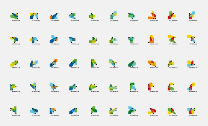
How did they achieve this? …you ask. Well they developed a distinct set of rules that the logo or logos needed to adhere to. In an almost mathematical method they determined that the juxtaposition of elements combined with limited color in a limited space could be produce nearly infinite results that retained similarities to each other. Above is a small sample of what this logic produced to view more on this unique creative process check out the video below.
Featured Video
As you can see the logo not only captures the energy of the people that work and study at the MIT Media Lab but also the energy of the space in which they work, going so far as to reflect various architectural attributes of the building itself. It is this type of abstract thought that separates MIT from most universities across the country. More importantly though, they have unlocked the potential of something truly innovative. I think we can all agree that this is a revolutionary approach to the static ideals of logo design we have become accustomed to.
3


Comment